"Supercompensation: In sports science theory, supercompensation is the post training period during which the trained function/parameter has a higher performance capacity than it did prior to the training period."
Now what this definition doesn't include, is a picture, or much of anything really that hints at how we can go about inducing a supercompensation effect. In the interest of progression, here is the simplest picture I could find of the supercompensation curve.
 |
| Please Disregard Curve "A" and "C" for Now. |
Just kidding, that's not the simplest one I could find, but it's a dandy. For the purpose of understanding supercompensation at it's most fundamental level, concentrate on Curve "B" (Solid Black Line) for now. To make the most efficient use of this graph, I want to draw your attention to five "events" that are taking place on it. In order to make this process a little easier, I'll do some quick doodling to spare time and confusion.

Ok, in North America, we read left to right.. So hopefully that's what you're doing with the image here. So I've just drawn 5 circles on the curve to bring attention to the major events that take place along it. I'll even bullet point it so it's really hard to screw up.
- Green Circle - Indicates the current "fitness" or "preparedness" level. (Horizontal Line.)
- Orange Circle - Indicates fatigue or decrease in fitness/preparedness due to training stress.
- Blue Circle - Indicates recovery to baseline fitness level or regular compensation.
- Purple Circle - Indicates increased fitness/preparedness as result of adaptation to training stress.**
- Red Circle - Indicates uninterrupted cycle. Extended rest = return to base fitness/preparedness levels.
**Supercompensation or the performance increase as a result of the training stress answers the question: Why do we train?
Hopefully you've gathered from the asterisks and footnote that step 4 is where the important stuff happens. Increased fitness/preparedness is the reason we train, to ultimately improve performance. Notice also that I wrote "uninterrupted cycle" in step 4. The return to baseline levels of fitness/preparedness occuring in the red circle indicates that there has been adequate rest allowing the adaptation to effectively dissipate. If you understand that sentence, and like lifting heavy stuff, you understand that this is bad news. The reason that understanding this cycle is important, is this: Once supercompensation occurs, you can use the newly acquired fitness/preparedness levels to achieve greater levels of strength. This will help turn that trivial buffer zone into the solidified start of the NEXT supercomp cycle. To illustrate this I've also charted the last four weeks of my own personal squat training.
 |
| 4 Week Volume/Intensity Relationship - Squat |
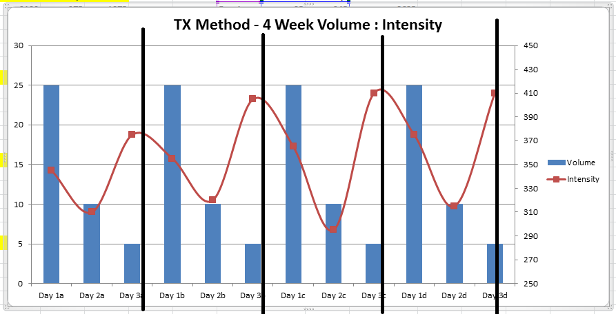
So here is the exact same graph, divided by the scientifically implemented (MS Paint) black bars to separate each cycle of supercompensation. You'll effectively see the same 5 points brought up in the theoretical graph in this article as they pertain to this real life application.
To further illustrate this on a more holistic chart, I've created a line using values that are a product of both volume and intensity. It is included below.

** The inclusion of volume in the values skewed the chart causing the supercomp effect to appear on the first day of each week. In this case, the cycle still occurs regularly, but in a different regard.

Finally, this last chart is divided into cycles, similarly to the one above. Because the volume heavily skewed the total values, I've divided it on the first days of each week.
Just a few more ideas using the visual representations to help illustrate a point. Will likely be using more of these in the next few posts as I find them really useful.
-Alex
Just a few more ideas using the visual representations to help illustrate a point. Will likely be using more of these in the next few posts as I find them really useful.
-Alex
No comments:
Post a Comment
Give us your thoughts!